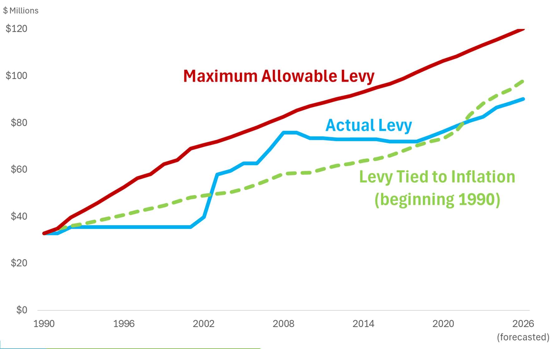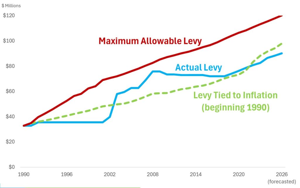
A line graph comparing three levy trajectories in millions of dollars from 1990 to 2026 (forecasted): the Maximum Allowable Levy (red), the Actual Levy (blue), and a hypothetical Levy Tied to Inflation beginning in 1990 (green dashed). The Actual Levy remained well below the Maximum Allowable throughout the period, with both projected to converge toward approximately $90–$120 million by 2026.Open full document
Notes
Chart comparing three levy scenarios from 1990 to 2026: Maximum Allowable Levy (red line showing steady growth to $120M), Actual Levy (blue line showing periods of flat growth), and a hypothetical Levy Tied to Inflation beginning in 1990 (green dashed line). Shows actual levy catching up to other scenarios around 2020.