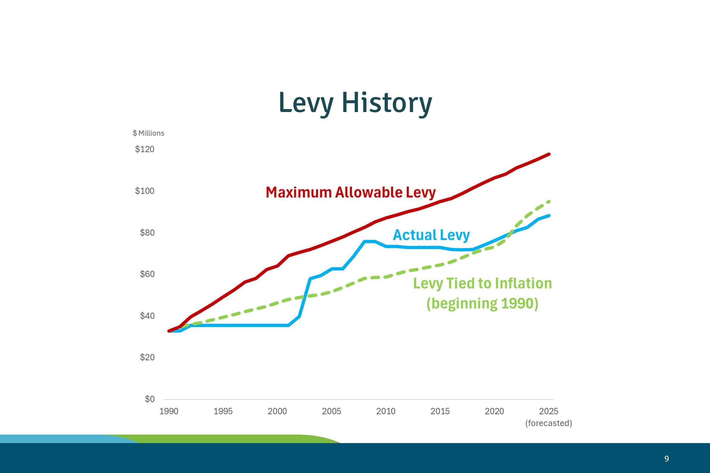
A line graph titled 'Levy History' showing three trends in millions of dollars from 1990 to 2025 (forecasted): the Maximum Allowable Levy (red), the Actual Levy (blue), and a Levy Tied to Inflation beginning 1990 (green dashed). The actual levy consistently falls below the maximum allowable, while tracking close to the inflation-tied projection in later years. Slide number 9 is visible in the lower right corner.Open full document
Notes
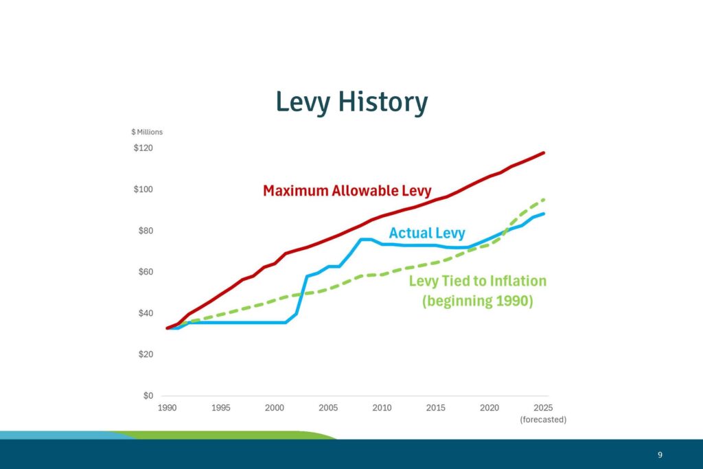
A line graph titled ‘Levy History’ showing three trends in millions of dollars from 1990 to 2025 (forecasted): the Maximum Allowable Levy (red), the Actual Levy (blue), and a Levy Tied to Inflation beginning 1990 (green dashed). The actual levy consistently falls below the maximum allowable, while tracking close to the inflation-tied projection in later years. Slide number 9 is visible in the lower right corner.