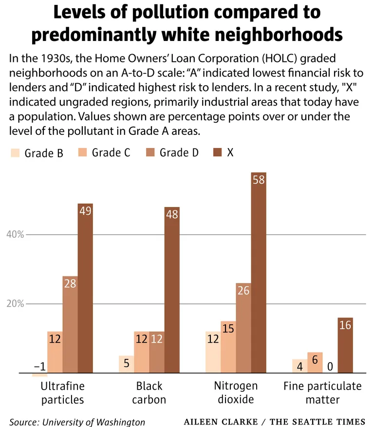
A bar chart published by The Seattle Times (credit: Aileen Clarke), sourced from the University of Washington, showing pollution levels (ultrafine particles, black carbon, nitrogen dioxide, fine particulate matter) in HOLC-graded neighborhoods (B, C, D, and ungraded 'X') expressed as percentage points above or below Grade A (predominantly white) areas. Grade X (formerly industrial) areas show the highest excess pollution across most categories, reaching +58 percentage points for nitrogen dioxide.Open full document
Notes
A bar chart published by The Seattle Times (credit: Aileen Clarke), sourced from the University of Washington, showing pollution levels (ultrafine particles, black carbon, nitrogen dioxide, fine particulate matter) in HOLC-graded neighborhoods (B, C, D, and ungraded ‘X’) expressed as percentage points above or below Grade A (predominantly white) areas. Grade X (formerly industrial) areas show the highest excess pollution across most categories, reaching +58 percentage points for nitrogen dioxide.