
We rarely talk about the website. But we wanted to comment on some improvements we’ve started making to one of the most popular features: Noise Reports.
Speed
Long story, short, we figured out a way to make the reports run very fast!
This has been really frustrating. They took forever to run and sometimes just died. There are 450,000 flights every year and 24-28 noise monitors, with each flight passing over several monitors on its way in or out. That’s a lot of data to store and parse for a tiny organization.
What’s new
Reports: Fly Quiet?
In addition to the speed, we’ve started adding new measurements that may sound boring. DNL65 and Fly Quiet are in place now, more are on the way.
Most of the time, the Port will talk about ‘average’ noise rather than single events. Average for an entire day is referred to as ‘LEQ’. But the FAA has another average you have heard of: DNL65 – which is supposed to provide a ‘penalty’ for flights between 10PM and 7AM (aka ‘sleepy time’.) That’s what DNL65 is supposed to be – an ‘average noise level’ tuned to human beings. That is why it is used in Part 150 studies to determine who gets sound insulation.
So the new reports let you see not only the ‘average’ noise, they also let you compare the number of penalty events between 10PM and 7AM.
 But there is another metric the Port likes to use now, the voluntary Fly Quiet period of midnight to 5AM. They tout that Fly Quiet period heavily as significant progress on reducing noise. Our new report lets you see not only events inside that DNL65 penalty time, it lets you compare them with the Fly Quiet period so you can see for yourself what those four hours mean for you every night!
Maps (finally!)
We’ve added our first dynamic map: Port Packages
This shows both the older and newer DNL65 boundaries, plus all properties and schools within each. This will tell you which properties got sound insulation, which schools are covered, and who’s left out of important Port Package discussions – both for first time (new) and updates (the SIRRPP.)
What’s next?
We still need to do analytics – the entertaining things like charts and graphs that make this information more meaningful. As they say, one picture is worth a thousand words. There are patterns in this data that are far more important than these reports for understanding what’s happening over your neighborhood.
We’ve always had all the ‘data’: flights, sound insulation, finance, demographics, noise, pollution. The only people who knew were those who asked for research requests — mostly various groups and grad students. What we lacked were the ‘bones’ in place to make it user-friendly. Now that we do, we’ll be adding more maps and charts and visualizations to break down all this data by neighborhood, economics and demographics.
Why this matters … and another excuse
When we started, a lot of people thought that filing endless noise complaints would somehow change flight paths. (Spoiler alert: it didn’t.)
 We needed new reports to start detecting objective patterns. It’s not about complaints. It’s about public health. We don’t install pollution controls based on the number of phone calls. We install them based on tests that measure harms. The flight data gives us that information – whether people complain or not.
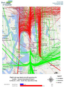
But it was simply too tough to see those patterns when you’d go to a Community Meeting and the only visual would be a flight track like this.
Overall, the number of flights continue to go up, Up, UP! But the patterns over each area remain consistent. Once we ran enough of our own reports and understood those patterns and trends, we stopped obsessing – they only change when a new airline route is added or dropped. Occasionally researchers need specific data. But the bigger picture is what matters if we’re going to get the entire community to a better place.
In other words, after we figured it all out, we left the rest of you hanging.
Reality check
We know these features are popular, and regardless, if you have something on your website, it should work. We are essentially five and a half people, and we’ve been working on a movie for three years. Those are our excuses and we’re sticking to them. We’re mentioning that because if you’d like to volunteer on various projects, we can always use help!
Call to action
We really hope you find these improvements useful. If you haven’t tried them, or haven’t tried them in a while, please do so and let us know what you think. Since we have more bandwidth now, let us know your questions, suggestions, and bug reports, and we will (finally) try to get them done.
Thank you so much for your expanded Noise Report. How convenient that port didn’t include the night time noisy cargo planes. from a grateful elder at Wesley Homes Des Moines.