Among all of the visual information published by the U.S. government, there may be no product with a higher information density than the Federal Aviation Administration’s (FAA) aviation maps. Intended for pilots, the FAA publishes free detailed maps of the entire U.S. airspace, and detailed maps of airports and their surroundings and updates them frequently. The density of the critical information layered on these maps is staggering, and it is a miracle that pilots can easily decipher these maps’ at a glance. But they can.
My father was a private pilot, and I first saw these maps folded up with my Dad’s training materials when he was studying for his pilot’s license when I was a kid. I was overwhelmed with the ordered chaos of these maps, and they made an impression on me.
There are several categories of aviation charts that the FAA makes available for download on their website. Let’s walk through some of the most used maps.
Terminal Procedure Publications
Terminal Procedure Publications (TPP) offer specific instructions for arriving or departing individual airports large and small across the U.S.. These maps are published in 25 editions, each covering different regions of the country. The whole set of maps published every 56 days (with the digital only versions published every 28 days).
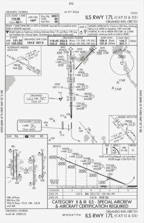
TPP map for Orlando International Airport.© Provided by Fast Company
The TPP maps are full of information, but compared to other FAA maps, are relatively stripped down. These maps are mostly black and white with very little color added as they are meant to give pilots the most relevant information about the airport they are navigating to.
Detailed diagrams of each airport, along with adjacent geographical features such as lakes and rivers, runways and nearby navigational waypoints help pilots set their radios to the correct control tower frequency, approach from the correct direction, and takeoff and land along a safe flightpath. The maps include details about obstacles (and their height), runway lights, runway length and the procedures for handling a “missed approach.”
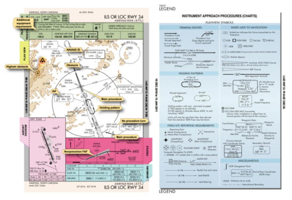
The larger airports give detailed departure instructions that allow pilots to navigate safely through extremely crowded skies along predefined airways a series of to navigation “fixes,” which are specific points of latitude and longitude that have been given pronounceable five letter names. More on these waypoint names later.
VFR vs. IFR
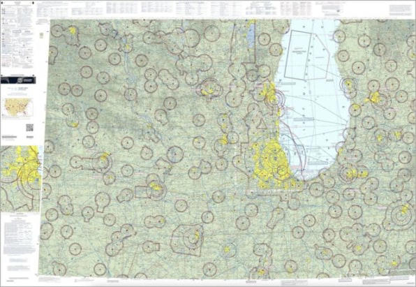
“Visual Flight Rules” (VFR) apply when there is generally good visibility, and features on the ground can be discerned by the pilot. For this type of flying, the FAA’s VFR maps can be used to spot important features on the ground that help pilots navigate and maintain situational awareness. These colorful maps bump the information density through the roof.
© Provided by Fast Company
“These are meant for you to follow VFR or visual flight rules. So, this is gonna to be on a day where you have at least three miles of visibility and 1,000 feet of clearance before the clouds,” said Ian Archibald, who is an Air Force veteran and commercial airline pilot. Ian is a friend of mine, and I asked him to help me understand the complexity of these maps, and how they are used.
“So, you’re able to see and look around and navigate on your own by referring to a map. You want to have a pretty detailed map because that’s gonna keep you alive.”
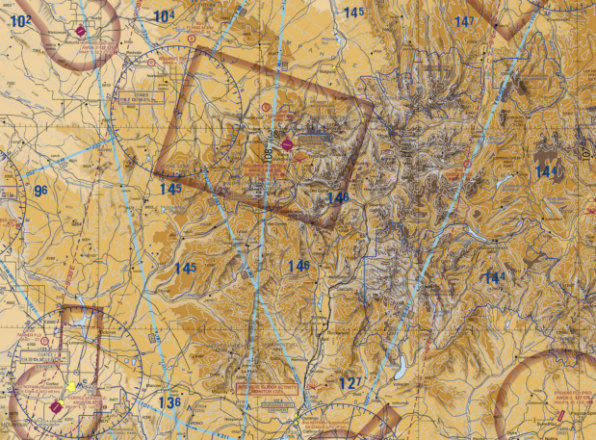
Telluride, CO.© Provided by Fast Company
VFR maps start with a base layer of geographical features such as rivers, lakes, and mountains and include features that could be visible from the air such as stadiums, windmills, power lines, and military bases. For each airport, the name, orientation of the landing strip, and airport control tower radio frequencies are noted.
Describing how a pilot might be using a VFR map like this, Archibald said “You can see water over here, you can see some stacks on the end of this peninsula or island over here. So you can identify those. Look at this—holy cow there’s a big mass of urban density up here and then, oh, I see some green fields and golf courses and undeveloped areas over here. So I must be somewhere around here.”
Archibald told me most commercial pilots are probably not using these exact maps, but are more likely using third-party apps on an iPad which come from companies like Boeing owned Jeppesen. Such maps combine government airport and navigation data with other sources. But the FAA VFR maps are still widely used. “New pilots are going to spend a lot of their time with this VFR map. This is the best visual data system. It’s amazing,” said Archibald.

The legend for these maps describes the many categories of information displayed. Colored rings denote different classes of airspace defined by altitude, each with their own rules. Special airspace zones such as military training areas or “National Security Areas” are also clearly marked, such as nuclear power plants, or sensitive sites related to national security. Restricted airspace is marked, where nobody is allowed to fly, such as the area surrounding the presidential retreat, Camp David in Maryland.
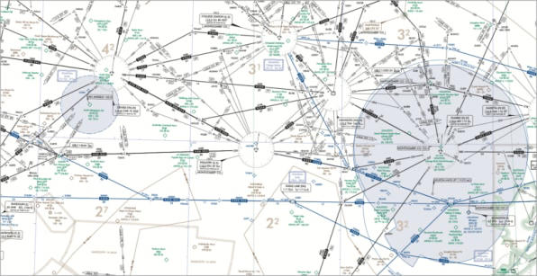
The other big category of FAA maps are “IFR ENROUTE” maps. IFR stands for Instrument Flight Rules, which the FAA defines as “Rules and regulations established by the Federal Aviation Administration to govern flight under conditions in which flight by outside visual reference is not safe. IFR flight depends upon flying by reference to instruments in the flight deck, and navigation is accomplished by reference to electronic signals.”
Where the VFR maps emphasize the features that can be observed with the pilot’s eyes, IFR maps place the focus on radio navigation. The IFR maps are published in two forms: low altitude and high altitude. Unlike the colorful VFR maps, these maps have the minimum amount of background information, containing mostly white space allowing the user to focus on important ground-based radio beacons and navigation waypoints clearly legible without any distractions.
Weird Waypoints
You may not realize it, but there are invisible highways in the skies. Planes don’t just point their noses at the spot they want to fly to (in most cases). That would create chaos in the skies that would be unmanageable. Instead, a series of different kinds of numbered point-to-point routes exist that planes enter and exit via known waypoints. These allow for predictable flight paths in the event of lost communication and can be found on the IFR and TPP maps.
These points are not related to anything on the ground, but rather are just named points of latitude and longitude that are published in maps that can be used to lay out a journey. These points are given five letter names, and are meant to be understood when spoken over noisy radio transmissions. “A lot of them are very strange and, you know the Russians pronounce them differently from the Dutch and, you know, stuff like that. So as we’re flying across Europe, you have to tune to the accents and figure out each one,” noted Archibald.
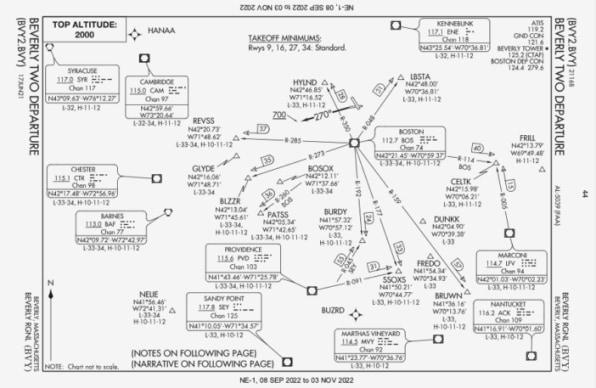
These waypoints are created with input from each airports’ ground controllers and they are quite colorful. Often these waypoint names will reflect the culture, food, or sports teams of the city they are near. Off the coast of New England, there is LBSTA and WHALE. Boston’s sports legacy gave us BOSOX, BRUWN, CELTS, PATSS, FENWY, ORRRR, and BORQE. Salem has WITCH, and Plymouth has PLGRM. Boston’s culinary traditions are not left out with CHWDH, CLAWW, and of course DUNKK. Star Trek’s Spock was played by Boston native Leonard NIMOY, who was honored with an eponymous waypoint.
Orlando, Florida has many Disney themed waypoints such as JAFAR, PIGLT, JAZMN, TTIGR, MINEE, HKUNA, and MTATA. Flying into Orlando, your plane might use the SNFLD arrival path, taking you past NOOMN, FORYU, SNFLD, JRRYY, and GTOUT.
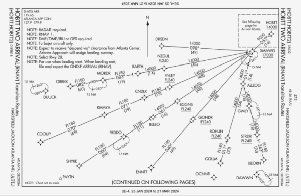
Based on the waypoints near Atlanta’s Hartsfield-Jackson International, this airport must be home to some of the nerdiest air traffic controllers. There’s a crazy number of Lord of the Rings waypoints:
HOBTT, SHYRE, FRDDO, BLLBO, BGGNS, NZGUL, RAETH, ORRKK,
GOLLM, ROHUN, GONDR, GIMLY, STRDR, SMAWG, and GNDLF.
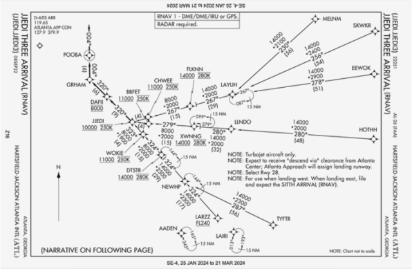
And a ton of Star Wars ones as well: SITTH, HOTHH, LARZZ, MELNM, FLKNN, LAYUH, EEWOK,
LLNDO, XWNNG, WOKIE, CHWEE, BBFET, NEWHP, SKWKR, and JJEDI.
Sometimes the order that the waypoints are traveled have meaning as well. Portsmouth International Airport at Pease in Portsmouth, New Hampshire has a series of waypoints that fans of Looney Toons would recognize:
ITAWT > ITAWA > PUDYE > TTATT > IDEED.
Flying into Ronald Reagan International Airport, a series of waypoints were renamed to commemorate the tenth anniversary of the 9/11 terrorist attacks, including this approach:
PLDGE > WEEEE > WILLL > NEVVR > FORGT > SEPII > ALWYZ.
Every city has some regional terms for their waypoints, and it is worth exploring some of the data.
In the run-up to the 2016 U.S. presidential elections, the FAA renamed some Florida waypoints that were named after a popular TV show personality, but had become controversial. The waypoints were DONLD, TRMMP, and UFIRD.
Republished with permission from Beautiful Public Data, a newsletter by Jon Keegan that curates visually interesting data sets collected by local, state, and federal government agencies.
To see more of the tools used to explore this data, read more at Beautiful Public Data. You can subscribe to the newsletter here.
